
10 Best Door Sign Ideas for Business and Home Use

A Door sign does more than identify a room, office, or storefront. It shapes expectations before anyone opens the door. Clear lettering, balanced spacing, and visible contrast can make a busy entrance feel calmer and more professional.

Industry research supports this practical effect. A 2012 FedEx Office survey, conducted with Ketchum Global Research, found that 68% of consumers believed a business’s signage reflected its quality. The same study reported that 76% had entered a business because its sign attracted attention. These findings show that small visual details can influence real decisions. Yet attention alone is not enough. A sign must also provide useful information quickly.

The International Sign Association’s research on on-premise signs also connects effective signage with business visibility and customer response. In home settings, the purpose changes, but the principle remains similar. A bedroom label, office marker, or privacy sign should be readable from the hallway without creating visual clutter. Materials matter too. A painted wooden sign feels warm, while acrylic or metal offers a cleaner commercial appearance. Accessibility deserves equal care, including strong contrast, readable type, and placement suited to different users. Local requirements may vary, so professional review remains sensible.

No single design wins every doorway. Some attractive signs become difficult to read at dusk. Others look polished online but feel oversized in a narrow hallway. This guide examines ten practical Door sign ideas for business and home use, balancing appearance, function, durability, and everyday user experience. Expect useful options, not perfect formulas.
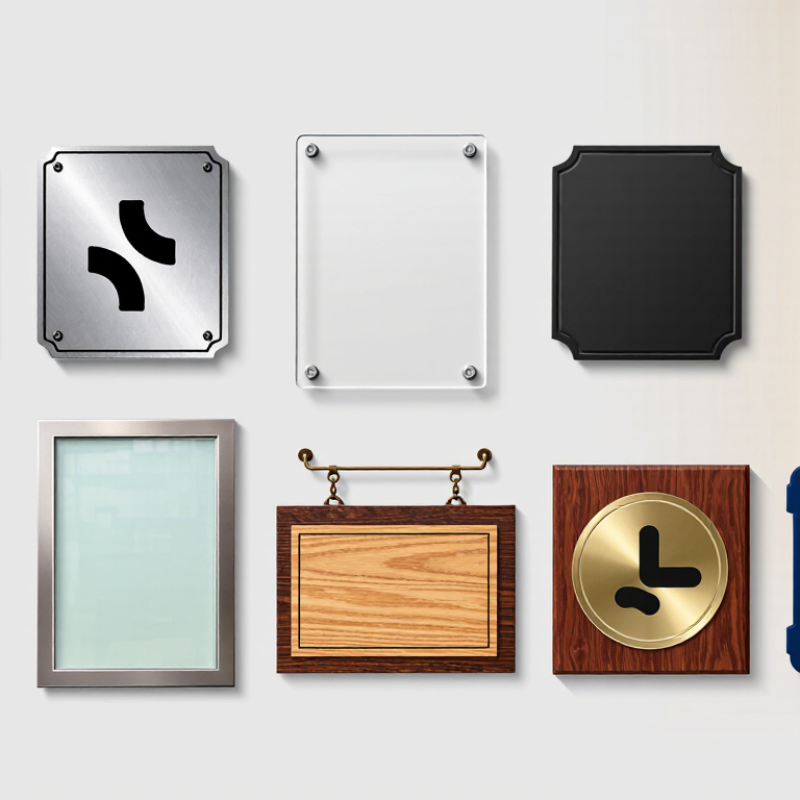
10 Best Door Sign Ideas for Business and Home Use

Compliance Foundation: ADA §703 Requires 5/8–2-Inch Raised Characters

The best door signs combine clear purpose with tactile compliance. ADA §703 requires raised characters to measure 5/8 to 2 inches high. This range applies to tactile signs identifying permanent rooms and spaces. Character height is measured using the uppercase “I.” Signs should also use high contrast, non-glare finishes, and simple sans-serif lettering. Braille belongs below the raised text, with proper spacing and placement.

Useful ideas include restroom signs, office identifiers, room numbers, conference rooms, staff areas, storage rooms, exit routes, stairways, elevator lobbies, and reception doors. A small room number beside the latch can feel ordinary, yet it supports independent navigation. A raised “Conference Room” label helps visitors confirm the correct door without asking for help. Keep the sign near the latch side, where users can find it consistently. Avoid placing it on a swinging door.

A common mistake is choosing attractive flat lettering and adding tactile text later. That can create uneven spacing or poor readability. Another mistake is treating every decorative sign as an ADA sign. Requirements depend on the sign’s function, location, and the facility type. Local building rules may add details. Measure each character with a reliable template before installation. Test the sign at arm’s reach, under bright and dim lighting. The design may look excellent on screen but feel crowded in real use. That practical check is easy to skip.

Wayfinding Essentials: ISO 7010 Standardizes Safety and Directional Symbols

10 Best Door Sign Ideas for Business and Home Use

Wayfinding Essentials: ISO 7010 Standardizes Safety and Directional Symbols

A door sign should answer one question quickly: “Where should I go?” ISO 7010 provides standardized graphical symbols for exits, first aid, fire equipment, and other safety information. Its value is consistency. A familiar running figure can communicate faster than a paragraph, especially during stress or poor visibility.

The U.S. Bureau of Labor Statistics recorded about 2.6 million nonfatal workplace injuries and illnesses in private industry during 2023. Clear wayfinding cannot prevent every incident, but it can reduce hesitation near exits, restrooms, stairways, and restricted areas. Use high contrast, readable lettering, and symbols placed at natural eye level. A simple arrow helps. A crowded sign does not.

For business doors, consider signs for reception, accessible facilities, emergency exits, staff areas, and meeting rooms. At home, useful choices include “First Aid,” “Utility Room,” “Guest Room,” and “Keep Clear.” ISO 7010 symbols work best when paired with plain language. Symbols alone may confuse visitors or children. That detail is easy to overlook.

Test each sign from the hallway, not only from the doorway. Check glare, viewing distance, lighting, and possible obstructions. Some signs look excellent in a design file but fail on a dim corridor wall. Local accessibility and fire-safety requirements may also apply, because ISO 7010 guidance is not automatically law everywhere. Reconsider placement after real use.

10 Best Door Sign Ideas for Business and Home Use - Wayfinding Essentials: ISO 7010 Standardizes Safety and Directional Symbols

Practical sign concepts using commonly recognized safety-color principles. Dimensions and mounting guidance are typical starting points, not substitutes for local building, fire, or accessibility requirements.
No. Door Sign Idea Best Use Primary Message Recommended Visual Treatment Suggested Starting Size Typical Placement ISO 7010 Relevance Accessibility and Readability Notes
1 Room Identification Sign Offices, bedrooms, classrooms, meeting rooms, and utility rooms Clearly identifies the room or space High-contrast text; optional room number and simple pictogram 150 × 200 mm On the wall beside the latch side of the door ISO 7010 does not prescribe ordinary room names; use standardized symbols where a safety message is included Use large sans-serif lettering, strong contrast, and non-glare materials
2 Restroom Sign Homes, workplaces, retail areas, and public buildings Identifies toilet facilities and, where applicable, accessible facilities Universal pictogram with concise text; use separate symbols for accessible facilities 150 × 150 mm Adjacent to the door, visible from the approach route Use standardized public-information symbols where available; ISO 7010 symbols should not be altered Provide tactile or Braille information when required by the applicable accessibility code
3 Emergency Exit Sign Workplaces, apartments, schools, and public facilities Shows an approved escape route or final exit White running-figure or exit symbol on a green safety background, with a directional arrow where required 200 × 300 mm or larger for long viewing distances Along the escape route and above or beside the exit door Related to ISO 7010 emergency escape and evacuation signs, including directional exit symbols Keep visible during normal and emergency lighting conditions; do not cover with décor or notices
4 Fire Extinguisher Location Sign Kitchens, workshops, offices, garages, and shared buildings Identifies the location of fire-fighting equipment White fire-extinguisher pictogram on a red safety background 150 × 200 mm Directly above or immediately beside the equipment Corresponds to the ISO 7010 fire-fighting equipment sign family Maintain an unobstructed sightline and use durable, heat- and moisture-resistant printing
5 Do Not Enter Sign Private offices, staff-only areas, storage rooms, and restricted corridors Prevents unauthorized access Black text or pictogram on a white field with a red prohibition circle and diagonal bar 150 × 200 mm At eye level on the approach side of the door Uses the ISO 7010 prohibition-sign principle; select the exact standardized symbol appropriate to the hazard Use direct wording and a clear pictogram; avoid relying on color alone
6 Authorized Personnel Only Sign Server rooms, laboratories, maintenance areas, and records rooms Restricts access to trained or approved personnel Bold text with a person, key, or access-control pictogram; use a supplementary explanation if needed 150 × 200 mm Beside the door handle or access reader Use an ISO 7010 prohibition or mandatory symbol only when it accurately communicates the restriction State the required action plainly; include contact information only when it remains legible at the viewing distance
7 Keep Door Closed Sign Fire doors, cold rooms, storage areas, and quiet rooms Requests that the door remain closed after use Short imperative wording with a door pictogram; use red only when connected to a safety or fire-control function 100 × 150 mm Centered at eye level on the push side of the door May use an ISO 7010 mandatory-action style where a specific standardized symbol applies Use simple language, matte finish, and sufficient contrast against the door surface
8 Wet Floor or Cleaning in Progress Sign Bathrooms, hallways, entrances, and service areas Warns people about a temporary slip hazard Black exclamation or slipping-person pictogram on a yellow warning background with black border 200 × 300 mm On or immediately beside the affected doorway and route Uses the ISO 7010 warning-sign color principle; choose the precise symbol according to the hazard Position before the hazard, not after it; remove the sign when the hazard no longer exists
9 Accessible Entrance Sign Entrances, service counters, restrooms, and rooms with step-free access Identifies an accessible route or facility Recognizable accessibility pictogram with concise supplementary text where necessary 150 × 150 mm At the entrance or at the decision point leading to the accessible route Use the applicable standardized accessibility symbol and follow local accessibility regulations Maintain clear floor space, avoid glare, and provide tactile information where legally required
10 Directional Door Sign Lobbies, corridors, home offices, clinics, and multi-room facilities Directs users toward a destination such as reception, stairs, or an exit Destination name plus a clear arrow; pair with a relevant standardized pictogram when available 200 × 300 mm for corridors; larger for long viewing distances At corridor junctions, door approaches, and other decision points ISO 7010 standardizes many safety-related symbols and directional concepts; local wayfinding rules may also apply Use consistent arrow styles, plain language, adequate spacing, and a color contrast ratio suitable for the environment

Business Signs: Room, Privacy, Accessibility, and Brand-Identity Solutions

A strong business door sign should answer a question quickly: What happens here? Room signs can identify meeting rooms, studios, storage areas, or staff spaces. Use clear names, readable lettering, and strong contrast against the door. A small occupied or available indicator can reduce interruptions during meetings. Privacy signs should be direct, not decorative. “Please Knock” feels warmer than “Do Not Enter,” but both need consistent placement. Mount signs near eye level, while checking the door swing and nearby lighting.

Accessibility requires more than adding a wheelchair symbol. Use tactile lettering and Braille where appropriate, with enough contrast for people with limited vision. Confirm placement against current local accessibility requirements before installation. Avoid glossy surfaces that create glare. Rounded edges, durable materials, and secure mounting also improve daily safety. These details matter in busy corridors, especially near restrooms, elevators, and shared workspaces.

Brand identity can appear without overwhelming the message. Match the sign’s colors, spacing, and tone with the interior, but keep words easy to read. A quiet reception sign might use warm typography, while a workshop needs bold, highly visible labeling. I still think some offices overdesign simple signs. A beautiful sign that confuses visitors has missed its purpose. Test each sign from several steps away, during both daylight and evening lighting. Small revisions often make the clearest difference.

Home Signs: Welcome, Delivery, Pet, Room, and Emergency-Information Ideas

10 Best Door Sign Ideas for Business and Home Use

A useful home sign answers a question before anyone knocks. A warm “Welcome” plaque can include the family name, but less information is often safer. For deliveries, try “Please leave parcels inside the covered entry.” Global parcel volume reached 161.8 billion items in 2023, according to the Pitney Bowes Parcel Shipping Index 2024. Clear instructions can reduce missed drops and weather damage. A pet sign should name the animal type, not invite unnecessary contact. The 2023–2024 National Pet Owners Survey reports that 66% of U.S. households own a pet. “Dog inside—please knock softly” feels more helpful than a threatening warning.

Room signs should be simple, especially in busy homes. “Office,” “Nursery,” or “Guest Room” works at a glance. Use high contrast, readable lettering, and a finish that survives fingerprints. I still make signs too decorative sometimes. They look lovely, yet visitors pause longer. That is a design failure. Emergency-information signs need careful judgment. NFPA’s Home Structure Fires report recorded an annual average of 346,800 home structure fires in the United States from 2017 to 2021. A visible sign can show emergency contacts, medical alerts, or utility locations, but never display unnecessary private data.

Tips: Place delivery signs near eye level. Keep emergency details updated every six months. Add symbols for quick recognition. Test each sign from the walkway, at night, and through a rain-speckled window. A small mistake becomes obvious then.

Evaluation Checklist: Compare Contrast, Durability, Legibility, and Placement

The best door sign is not always the most attractive one. Compare ten ideas by purpose: room labels, reception plaques, suite numbers, restroom signs, warning notices, and house-name plates. A matte plaque may look refined, while a high-contrast printed panel performs better in dim corridors. The World Health Organization reports that at least 2.2 billion people live with near or distance vision impairment. Legibility deserves more attention.

Test each design from three distances. Use large, simple lettering, strong contrast, and generous spacing. Avoid thin scripts and glossy finishes that reflect overhead lights. The U.S. Access Board’s 2010 ADA Standards specify raised characters and Braille for many permanent room and space signs. Local requirements may differ, so verify them before installation. Readability wins.

Durability also needs comparison. Metal, engraved plastic, sealed wood, and weather-resistant composites suit different conditions. In a busy office, cleanability and scratch resistance matter more than decorative texture. Outdoors, check ultraviolet exposure, rain, temperature changes, and mounting strength. Placement is equally practical: position the sign near the handle side, keep it visible from the approach, and avoid door-swing conflicts. ISO 3864 emphasizes consistent contrast and safety-sign presentation, but ordinary identification signs still need human testing. Ask someone unfamiliar with the building to find the door. If they hesitate, the design needs revision. My own mistake was choosing a beautiful dark finish that disappeared at night.

10 Best Door Sign Ideas for Business and Home Use

Evaluation checklist: contrast, durability, legibility, and placement flexibility

Scores use a practical 1–10 planning scale based on common material characteristics, visibility, maintenance needs, and suitability for indoor or outdoor placement. Higher scores indicate stronger overall performance for the selected criterion.

Article Source:

Certified Quality System

© North Easton Machine Company, Inc. All rights reserved. • Site: Blog
NORTH EASTON MACHINE • 218 Elm Street • North Easton, MA 02356 • 508-238-6219